
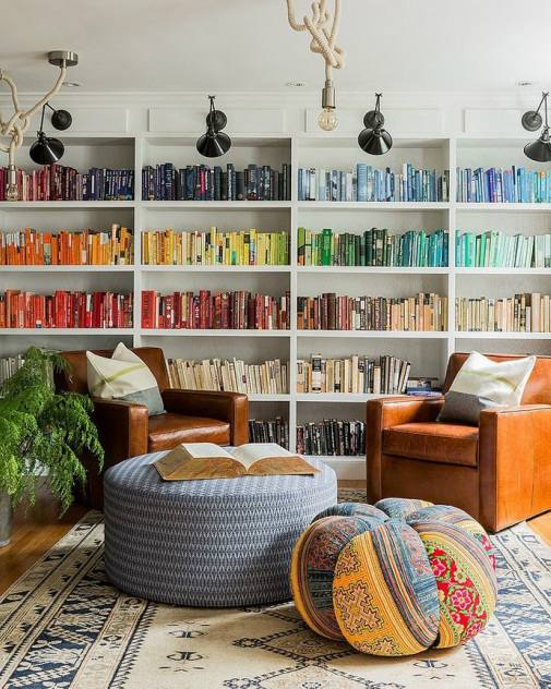
 Room by Hudson Interior Design Room by Hudson Interior Design Staving off apartment entropy is a constant battle; I have to fight hard against my messy nature. I have been trying to incrementally de-clutter our apartment, and sometimes practicality - like having easy access to books (or, more likely, not having a receptacle to store them in) - must win, and clutter must be put on display rather than contained behind closed doors. How to cope? I have found an easy trick ("borrowed" from my good friend Kate P., who has an excellent eye) that easily makes viewable clutter appear "organized" and aesthetically pleasing: organize/arrange along a color gradient! It takes an otherwise visually distracting (and messy looking) display and makes it appealing to the eye. (And the feeling after completing this task is downright satisfying!) As you can imagine, this works best with books (though it can be done with other objects too). I have read that people who are hard-core organizers find this method of organizing books by color to be difficult to swallow ("How on earth would I find the book I need if it's not alphabetized!?") and others just take inexplicable offense to it (seriously, I had no idea it was so controversial), but for those of us who remember a book by its cover color rather than its title, this trick is a quick way to turn something displeasing into a lovely rainbow. It appears harmonious to the eye and creates an inner sense of order (and couldn't we all use a little of that?). Also, if you're prone to messiness like I am, it makes you feel downright pleased with yourself to be able to contain clutter in a pretty, organized fashion. It's the book organizing equivalent to making the bed (a satisfactory deed indeed). 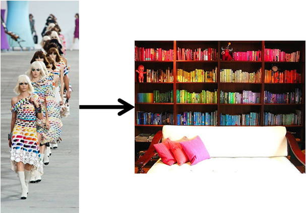 Left: Chanel Spring 2014 Runway; Right: A mega wall of rainbow books Left: Chanel Spring 2014 Runway; Right: A mega wall of rainbow books (Side note, I love the interplay between the fashion world and the world of interiors. Chanel's Spring 2014 runway featured some major rainbow action, and I am happy to carry that trend forward in the home. It's like having a little bit of Lagerfeld on the cheap!) 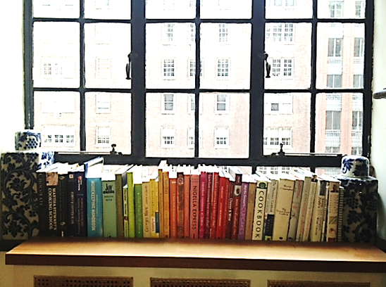 Our colorful cookbooks buttressed by two cannisters (a gift from Mom). Our colorful cookbooks buttressed by two cannisters (a gift from Mom). I have arranged books by color in two areas of our apartment: 1) with our cookbooks (left), which are proudly on display on the window sill in the alcove next to our kitchen (and viewable from the living room); and 2) with Matt's and my grad school books in our "office" area (thankfully hidden from living room view, but viewable in the slideshow below). The final product is decidedly less appealing with law and business school books than with cookbooks. Law books come in exactly two colors - blue and red (so stringent, these law types!) - and business school books are either case books with black binding or just atrociously ugly text books - but there is a certain level of satisfaction that can be achieved by finding a level of order and calm amid the chaos that is grad school (or really anything stressful). The real trick for organizing all those school books was scoring a ginormous bookcase from Craigslist (I refuse to pay retail for bookcases, and I'm happy to scour your local Craigslist for you), which Matt and I hauled home from a nearby apartment after work on Valentine's Day 2012 (I would make a joke about marriage and romance, but seriously, Matt's willingness to go along with my insane Craigslist furniture procurement schemes is one of his most loveable qualities). The best thing about this color arranging process is that there is really no right or wrong way to do it, though I would not recommend removing all of your books and starting from scratch (a truly daunting scene) - much easier to pull out a few and keep the majority of your books upright and intact and then move colors around incrementally from there. I am sure you could get very rigid in following the color wheel (and really, who's got time for that?), but I tend to just go from dark to light and see what works in between. Give it a whirl and see what you think! Happy harmonizing! :) KK
1 Comment
Katherine
11/14/2013 12:02:06 am
I tried this in the office...def makes there appear to be some order to the chaos! Leave a Reply. |
Kate KellyI am an artist/designer and former financial professional with a background in comparative literature, business and design. I live in New York with my overworked lawyer husband and my two boys Michael and Theo and spend much of my free time dreaming about how to enhance the aesthetics of our little world. I am endlessly inspired and always in search of something new. This is a blog about my search, my inspiration and things I just really, really like or want. Archives
April 2021
Categories
All
|
 RSS Feed
